

Last time we introduced decision trees and a tool we’ve made to explore them. With that tool, embedded in a simple game (Arbor), you can generate data from alien creatures with a simulated malady, figure out its predictors, and make a decision tree that will let you automate its diagnosis. (Here is the link to that not-quite-game.)
Your job was to get through the diseases ague and botulosis. Today I want to reflect on those two scenarios.
Ague
Ague is ridiculously simple, and with that ridiculous simplicity, the user is supposed to be able to learn the basics of the game, that is, how to “drive” the tools. One way to figure out the disease is to sort the table by health and see what matches health. Here is what the sorted table looks like:

Just scanning the various columns, you can see that health is associated with hair color. Pink means sick, blue means well. With that insight, you can go on to diagnose individual creatures and then make a simple tree, which looks like this:

Although there is a lot of information in the tree, users can generally figure it out. If they (or you) have trouble, they can get additional information by hovering over the boxes or the links.
Sorting works well in this case, but it gets unwieldy with more complicated diseases and larger data sets. Graphs are more versatile, and since we’re in CODAP, graphs are easy to make. Here is a graph of health (the dependent variable, after all) against hair:

This is not a typical school graph, but with very little practice, students (we hope) can see that it shows a clear separation between the healthy and sick creatures, and that hair color is characteristic of that separation. We could also say that hair color perfectly predicts health—at least with this initial data set of 10 cases.
Making a graph is, in general, a great way to start exploring data. In fact, I think that making a graph early is good evidence of some kind of data smarts. Putting the dependent variable—the thing you’re trying to predict—on the graph is another indicator, showing that you know what you’re looking for. Yet in general, we do not see students instinctively making graphs as an early step in their analysis; I hope that experience with activities like this will help prompt that strategy.
Botulosis
Let’s do the next-harder disease, botulosis. We make a graph, put health on the vertical axis, and then try various other variables (predictors such as hair, eyes, weight…) on the horizontal axis.
To make things easy, this disease is also related to hair; that first graph we made for ague looks like this for botulosis (on the left):


There is a clear separation here, but it’s not as complete. What can we tell from this graph? It looks as if all blue-haired creatures are well—but we can’t tell about pink-haired creatures. Where do we go from here? There are a number of paths to take. Here’s one:
Suppose we start making a tree, leaving the pink branch incomplete (illustration above right). We’re now done with the blue group and want to restrict our analysis to the pink-haired creatures. So we click on the pink box (lower left in the tree) to select those cases in the graph. Then, in the graph, we use the “eyeball” menu and choose Hide unselected cases. (We could also just select them in the graph.)
With only the pink cases remaining, we can try other variables on the horizontal axis. When we try eye color, we see this:
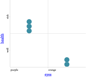
Aha! A complete separation—for the pink subset. Orange eyes means well, purple means sick. So we add another branching to the tree, only to the pink side (left):


This tree will correctly diagnose all future cases. You could also have done eyes first, and gotten a different, equivalent tree (right).
What other graph could we have made? One great one is to put eyes on one axis and hair on the other, and drop health into the middle, making a colored legend:

We have seen users reason with this graph in two ways.
- Some say that in this graph, it’s clear that to be sick, you have to have purple eyes and pink hair.
- Alternatively, some say that to be well, you have to have blue eyes or orange hair.
Reflection
We made these very very very simple situations because when we used the tool on more complicated situations, even though we designed the tool and have decades of experience with data and technical things, we got easily confused. It was amazing how we ground to a halt and had to say, “wait—what does this mean?”
And I imagine that all of you, when you played with botulosis (okay, except for gasstationwithoutpumps, who gets everything immediately) had a similar experience. There was at least a pause where you had to think, what does this graph mean? Or how do I express my rule in the tree?
Part of this is limitations in the tool. But I think a lot of it comes from the amazing importance of alternative representations, and how great it is to wrestle with unfamiliar ones.
Let’s elaborate on the theme of representations to think about a connection to computational thinking. As coders, we look at the Boolean statement above—sick creatures have purple eyes and pink hair—and think, “easy peasy, it’s an and statement.” But there is a pause when we see the graph and try to map that graph onto our understanding of and, even though the graph itself looks exactly like the truth tables we saw ages ago. And for me, there is an even longer pause when I try to map the and onto the tree. For me, conceptually, and is symmetrical, but the tree is not. (And then I realize, crikey, deep down inside, and is probably implemented asymmetrically.) I know that the tree is how we might represent the doctor’s procedure for diagnosing these diseases—but before playing with the trees, it didn’t look like and to me.
And if we are wresting with deeper understanding of a Boolean and, what is it like for a student who has not put in his or her 10,000 hours?
I think this is an example of a spot in data science education where non-coders can get tripped up. Therefore it’s a perfect place to slow down and point out how our understanding of the colloquial and maps onto the Boolean and, and how the “and” concept appears in other representations such as trees and graphs.
(As an aside, note that the two user renderings of the botulosis rule—the and and the or versions—are an example of deMorgan’s rule, the essential connection between those two operators.)
There are many things to do with the trees and the Arbor game beyond this. Some examples:
- We only used 10 cases. How many more cases should we have gotten in order to be confident in our diagnoses?
- What about when you cannot predict the disease perfectly? (Later diseases in the menu are not perfectly predictable.)
- How do you measure how good the tree is?
- How do you set optimum “cut points” for continuous variables?
- How complicated a tree should you make? Is there danger of overfitting (yes!)?
So go forth and play! See what you think!

There is a better visualization (though I don’t know if it possible with your tool). Use color to mark sick and well, and then do a scatter diagram of 2 traits at a time. Clusters of the same color are visually more distinguishable than trying to combine 2×2 contingency tables mentally.
I think that’s the point of the last figure. Am I missing something?
You’re right, the last figure is what I had in mind—I just mis-parsed it on the first quick read as yet another contingency table. I’m used to having the variables be more continuous, rather than binary variables, so it didn’t immediately look like a scatter diagram.