Time series without time on an axis

Long ago I promised a post (to come quickly; apparently I lied) about this topic.

If we have time-series data, we typically put time on the horizontal axis. But that’s not the only way to represent something that changes in time. There is an alternative that’s closely related to parametric equations and graphs.

Consider this typical physics-class situation: you have a weight on a spring moving up and down. You can plot its position as a function of time. For regular old Hooke-ian springs where F = -kx , that will be a sinusoid.

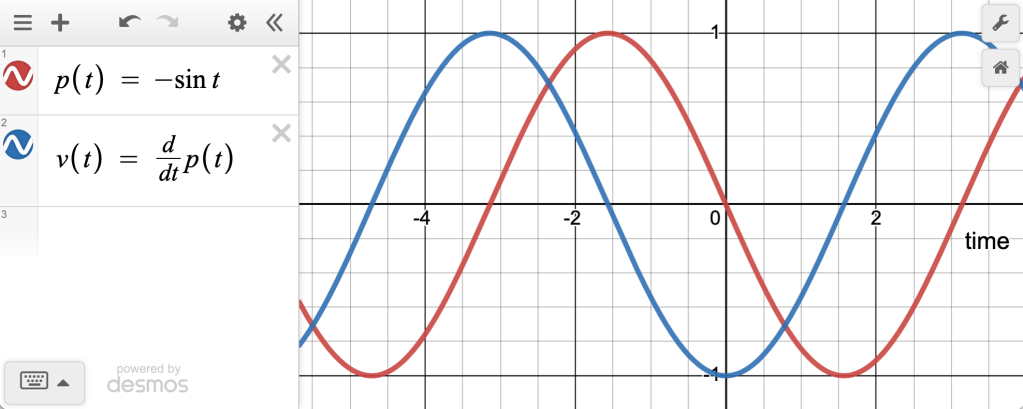
Now plot the velocity as a function of time. That will also be a sinusoid, but shifted by \frac{\pi}{2} , like this:

Position (red) and velocity (blue) for a weight on a spring. Or the bob of a pendulum. Or any number of things.

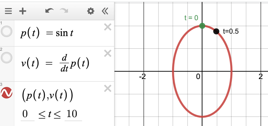
These are normal time-series functions, drawn with time on the horizontal axis. But as you may remember, you can instead plot them with the position on the x axis and velocity on the y , making a new point for every value of t :

Velocity (y) against position (x). Two points are labeled with time, showing that in this diagram, as time passes, the point moves in a clockwise direction.

There are many cool things about this, like what happens when the frequency of x is different from y , or when the delay is not 90°, and you get a wide variety of Lissajous figures. Or when you plot the velocity of a chaotic system against position…but that would be more of a digression than we want here.

Can we ever see this in real-world data, like, not from our imagination of a physics lab activity? Sure!

Here is one of my favorites, drawn from the “Blodgett” dataset available at codap.xyz. There we have air temperature in the Blodgett forest over the course of a year. We also have soil temperature. Here is one day of both plotted as traditional time series:
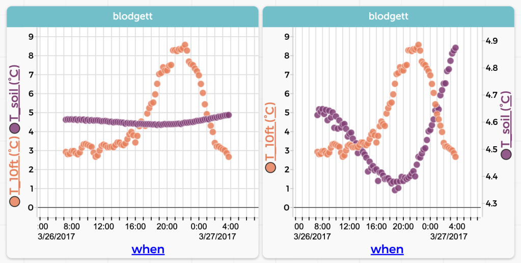
Air (orange) and soil (purple) temperatures for one day in March 2017. The left-hand graph uses the same scale for both.

Now here is the same data plotted with soil temperature on the vertical axis and air on the horizontal. In this plot, time is going counterclockwise:
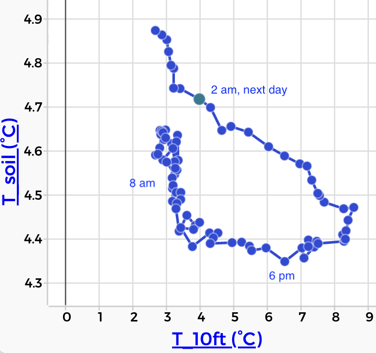
Soil versus air temperature. Time increases as you travel counterclockwise around the loop.

If you’re like me, that graph does not immediately shout what’s going on. But with some practice, we realize that the shape of the loop tells us about the delay between the air temperature and the soil temperature.

The point being, there are more ways in heaven and earth [Horatio] to display time series. Usually, of course, stick time on the horizontal. But be open to intriguing alternatives.

DASL Updated. Mostly improved.

Smoking and cancer graph.
Data from DASL, graph from CODAP. LUNG is lung cancer deaths per 100,000. CIG is number of cigarettes sold (hundreds per person). Data from 1960.

The Data and Story Library, originally hosted at Carnegie-Mellon, was a great resource for data for many years. But it was unsupported, and was getting a bit long in the tooth. The good people at Data Desk have refurbished it and made it available again.

Here is the link. If you teach stats, make a bookmark: http://dasl.datadesk.com/

The site includes scores of data sets organized by content topic (e.g., sports, the environment) and by statistical technique (e.g., linear regression, ANOVA). It also includes famous data sets such as Hubble’s data on the radial velocity of distant galaxies.

One small hitch for Fathom users:

In the old days of DASL, you would simply drag the URL mini-icon from the browser’s address field into the Fathom document and amaze your friends with how Fathom parsed the page and converted the table of data on the web page into a table in Fathom. Ah, progress! The snazzy new and more sophisticated format for DASL puts the data inside a scrollable field — and as a result, the drag gesture no longer works in DASL.

Fear not, though: @gasstationwithoutpumps (comment below) realized you could drag the download button directly into Fathom. Here is a picture of a button on a typical DASL “datafile” page. Just drag it over your Fathom document and drop:

DragTarget

In addition, here are two workarounds:

Plan A:

  • Place your cursor in that scrollable box. Select All. Copy.
  • Switch to Fathom. Create a new, empty collection by dragging the collection icon off the shelf.
  • With that empty collection selected, Paste. Done!

Plan B:

  • Use their Download button to download the .txt file.
  • Drag that file into your Fathom document.

Note: Plan B works for CODAP as well.

The Index of Clumpiness, Part Four: One-dimensional with bins

In the last three posts we’ve discussed clumpiness. Last time we studied people walking down a concourse at the big Houston airport, IAH, and found that they were clumped. We used the gaps in time between these people as our variable. Now, as we did two posts ago with stars, we’ll look at the same data, but by putting them in bins. To remind you, the raw data:

Raw IAH

Continue reading “The Index of Clumpiness, Part Four: One-dimensional with bins”

The Index of Clumpiness, Part Three: One Dimension

In the last two posts, we talked about clumpiness in two-dimensional “star fields.”

  • In the first, we discussed the problem in general and used a measure of clumpiness created by taking the mean of the distances from the stars to their nearest neighbors. The smaller this number, the clumpier the field.
  • In the second, we divided the field up into bins (“cells”) and found the variance of the counts in the bins. The larger this number, the clumpier the field.

Both of these schemes worked, but the second seemed to work a little better, at least the way we had it set up.

We also saw that this was pretty complicated, and we didn’t even touch the details of how to compute these numbers. So this time we’ll look at a version of the same problem that’s easier to wrap our heads around, by reducing its dimension from 2 to 1.  This is often a good strategy for making things more understandable.

Where do we see one-dimensional clumpiness? Here’s an example:

One day, a few years ago, I had some time to kill at George Bush Intercontinental, IAH, the big Houston airport. If you’ve been to big airports, you know that the geometry of how to fit airplanes next to buildings often creates vast, sprawling concourses. In one part of IAH (I think in Terminal C) there’s a long, wide corridor connecting the rest of the airport to a hub with a slew of gates. But this corridor, many yards long, had no gates, no restaurants, no shoe-shine stands, no rest rooms. It was just a corridor. But it did have seats along the side, so I sat down to rest and people-watch.

Continue reading “The Index of Clumpiness, Part Three: One Dimension”

Talking is so not enough

We’re careening towards to the end of the semester in calculus, and I know I’m mostly posting about stats, but this just happened in calc and it applies everywhere.

We’ve been doing related rate problems, and had one of those classic calculus-book problems that involves a cone. Sand is being added to a pile, and we’re given that the radius of the pile is increasing at 3 inches per minute. The current radius is 3 feet; the height is 4/3 the radius; at what rate is sand being added to the pile?

Never mind that no pile of sand is shaped like that—on Earth, anyway. I gave them a sheet of questions about the pile to introduce the angle of repose, etc. I think it’s interesting and useful to be explicitly critical of problems and use that to provoke additional calculation and figuring stuff out. But I digress.

Continue reading “Talking is so not enough”

Quick Check-in

Okay: one class down, 27 to go. The big problem right now is scheduling “lab” time, and extra hour a week that will make up the rest of the time we need to get through the material and learn the stuff that’s not in the ISCAM text, such as EDA and more probability.

I do not yet have sense of how fast we can get through some of the investigations; I have hopes that once we get the hang of it, some can be slower and more thoughtful, while others can be more practice- and application-y.

I did start with good old Aunt Belinda, for comfort sake. It’s odd; I may go more slowly—too slowly—when I’m more familiar with the approach.

I’ll know a lot more next week.

Teaching Stats Again

It’s Sunday. On Thursday, Math 102—Statistics and Probability—has its first meeting at Mills College, and I am allegedly in charge. This is a one-semester course, and at the college level, calculus required, in contrast to the year-long, high-school, non-AP classes I taught a few years ago.

So we will have to move pretty fast, but the students have more experience, which I hope will mostly be a good thing.

I’ve just come back from a few days at Cal Poly, watching Beth Chance and Allan Rossman actually teaching their courses, to see what the masters look like in action. It was inspiring and daunting. One thing Beth said that made me grimace was how important it was to take a few minutes to reflect on what worked. So here I am, gonna try again. I have hopes but make no promises, as this semester will be packed: I’m also teaching Calculus I and Multivariable, two more courses I’ve never taught before. I took them in college, and did well, though; OTOH, it’s been a long time since Green’s Theorem: my 40th reunion is this spring.

So for any of you watching, some early remarks:

  • We’ll be using Beth and Allan’s newest offering, the “ISCAM” text.
  • I will of course be using a simulation-based approach to inference. ISCAM starts that way but quickly (I think) brings in Normal-based inference and t procedures. I’m re-ordering some of their investigations to bring the Normal in later.
  • Students get Fathom for free, still, so we’ll be using that; I’ll write Fathom-based instructions to replace the ones ISCAM uses for R. It will mostly be fine; I think I saw one thing in the R code that I didn’t know how to do in Fathom.
  • At the same time, Fathom has trouble right now: under Mavericks data import from Census or the Web is broken. That was so great in the past, but now many of my handouts from before will no longer work. Arrgh.
  • Simulation-based inference is a big enough deal now that some of the Big Dogs of the movement have a blog.
  • I hope to get a link to have my students do the CAOS test so we can compare. It will also give me a nice pre-assessment so I have a clue what they know about simple stuff.

Hanging Slinky Analysis 2: The Pre-Tension Wrinkle

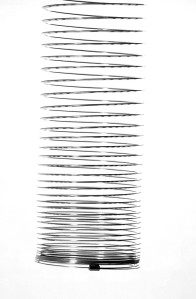
Hanging SlinkyLast time, we saw how the length of a hanging slinky is quadratic in the the number of links, namely,

\Delta x = \int \mathrm{d}x = \int_0^M \sigma mg \, \mathrm{d}m = \frac {\sigma M^2 g}{2},

where M is the mass of the hanging part of the slinky, g is the acceleration of gravity, and \sigma is the “stretchiness” of the material (related to the spring constant k—but see the previous post for details).

And this almost perfectly fit the data, except when we looked closely and found that the fit was better if we slid the parabola to the right a little bit. Here are the two graphs, with residual plots:

HangingSlinkBothGraphs

Continue reading “Hanging Slinky Analysis 2: The Pre-Tension Wrinkle”

Reflection on Modeling

Capybara. The world’s largest rodent.

I’m writing a paper for a book, and just finished a section whose draft is worth posting. For what it’s worth, I claim here that the book publisher (Springer) will own the copyright and I’m posting this here as fair use and besides, it will get edited.

Here we go:

Modeling activities exist along a continuum of abstraction. This is important because we can choose a level of abstraction appropriate to the students we’re targeting; presumably, a sequence of activities can bring students along that continuum towards abstraction if that is our goal.

As an example, consider this problem:

What are the dimensions of the Queen’s two pet pens?
The Queen wants you to use a total of 100 meters of fence to build a Circular pen for her pet Capybara and a Square pen for her pet Sloth. Because she prizes her pets, she wants the pet pens paved in platinum. Because she is a prudent queen, she wants you to minimize the total area.

Let’s look at approaches to this problem at several stops along this continuum:

a. Each pair of students gets 100 centimeters of string. They cut the string in an arbitrary place, form one piece into a circle and the other into a square, measure the dimensions of the figures, and calculate the areas. Glue or tape these to pieces of paper. The class makes a display of these shapes and their areas, organizes them—perhaps by the sizes of the squares, and draws a conclusion about the approximate dimensions of the minimum-area enclosures.

b. Same as above, but we plot them on a graph. A sketch of the curve through the points helps us figure out the dimensions and the minimum area.

Using Fathom to analyze area data. Sliders control (and display) parameter values. I have suppressed the residual plot, which is essential for getting a good fit.

c. This time we enter the data into dynamic data software, guess that the points fit a parabola, and enter a quadratic in vertex form, adjusting its parameters to fit the data. We see that two of these parameters are the side of the square and the minimum area.

d. Instead of making the shapes with string, we draw them on paper. Any of the three previous schemes apply here; and an individual or a small group can more easily make several different sets of enclosures. Here, however, the students need to ensure that the total perimeter is constant—the string no longer enforces the constraint. Note that we are still using specific dimensions.

e. We use dynamic geometry software to enforce the constraint; we drag a point along a segment to indicate where to divide the fence. We instruct the software to draw the enclosures and calculate the area. (In 2014, Dan Meyer did a number on a related problem and made two terrific dynamic geometry widgets, Act One and Act Two.)

f. We make a diagram, but use a variable for the length of a side. Using that, we write expressions for the areas of the figures and plot their sum as a function of the side length. We read the minimum off the graph.

g. As above, but we use algebraic techniques (including completing the square) to convert the expression to vertex form, from which we read the exact solutions. In this version, we might not even have plotted the function.

h. As above, but we avoid some messy algebra by using calculus.

Now let’s comment on these different versions.

Continue reading “Reflection on Modeling”