Letter Frequencies (and more) in Wordle

Let’s assume you already know about Wordle. As you may know, Wordle uses a curated list of five-letter words. For example, it doesn’t include plurals of four-letter nouns (no BOOKS) or past tenses ending in ED (no TIMED). The list is easily discoverable online, at least I discovered one and maybe it’s the one used in the puzzle. You can see it in this CODAP document.

But this blog is about data, so that’s where we’re going. You know from growing up with (or learning) English that E is the most common letter. You might even remember a mnemonic such is ETAOIN SHRDLU that’s supposed to represent the top dozen letters by frequency. I once learned ETAONRISH for the same purpose. These listings are not the same! How could that be?

Read more: Letter Frequencies (and more) in Wordle

Of course, it’s because they must have been compiled from different sources of text. Consider: suppose Blanziflor uses the words in a dictionary, while Helena uses the text of today’s New York Times. Helena might have more T, H, and E than Blanziflor simply because THE appears many times in her text but only once in Blanziflor’s.

So it might be interesting to look at letter frequencies in the “Wordle corpus,” if only to get an idea of which letters to try to fit into your next guess.

So, for your exploration and enjoyment, here is a CODAP document (same link as above) with “my” Wordle list, broken down into individual letters using the “texty” plugin.

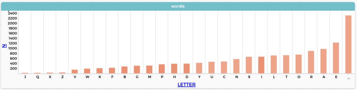
I get EAROT LISNC UY for the top twelve. See the graph at the top of this post.

To make that graph in CODAP, I grouped the data by letter, then made a new attribute to count() the number of appearances of each letter. That’s kind of an “intermediate” CODAP task with very little explanation; see if you can figure out how to do it.

The analysis also includes digraphs, that is, all the two-letter sequences, with the underscore “_” standing in for a space. So in the table below you see r_ (case 6) containing the last letter in CIGAR and _r (case 7) with the first letter in REBUT.

An interesting question here might be something like, “J is the least common letter. How many times does it appear? Is it always the first letter of the word?”

One more thing: is this cheating? Reasonable people can disagree; here’s how I draw that line: writing a version of WordleBot for personal use is an interesting programming challenge, but would be cheating for actually doing Wordle. Searching the word list using regular expressions is a no-no for sure. I think that looking at the word list while doing Wordle is still cheating, at least a little. But having looked at the word list is OK. Likewise, learning the frequencies of letters, I think, is OK: it’s enhanced common sense. It does not use the power of computing to be systematic and exhaustive.

Time Series! Smoothing and COVID (and folding, too)

Welcome to the third in a soon-to-end series in which I figure out what I think about time series data, and how it is different from the data we usually encounter in school assignments. We’re exploring what tools and techniques we might use with time series that we don’t traditionally cover in stats or science, and wondering whether maybe we should. For me and my CODAP buddies, it also raises the question of whether a tool like CODAP should have more built-in support for time series.

Smoothing

One of these tools is smoothing. There is smoothing (for example Loess smoothing) for other, non-function-y data, but smoothing is easier to understand with time series (or any other data that’s fundamentally a function; the previous post in this series explains this obsession with functions).

Since it’s December 2021, let’s stick with COVID and look at the number of new cases in the US by day (CODAP file here):

Daily newly reported COVID cases in the US. Data from https://ourworldindata.org/.
Graph in CODAP
Continue reading “Time Series! Smoothing and COVID (and folding, too)”

Time Series and Modeling

The second in a sequence of posts about time series. Here is the first one.

Students in traditional stats, as well as in science and math classes, learn linear modeling in the sense of finding a straight line that fits some data. Suitable data are often (but not always) time series: some phenomenon is increasing or decreasing regularly with time; you take repeated measurements; you plot the values against time; et voilà! A linear relationship.

Here is a data set I’ve used before. I put a pot of water on the stove, stuck a thermometer in the water, and turned on the flame. I recorded the time whenever the temperature passed another five degrees Celsius.

The author heated water on a stove. Graph in CODAP. We could clearly connect these dots with lines, and it would make sense.
Continue reading “Time Series and Modeling”

Thinking about Teaching and Time Series

Time series data shows the same phenomenon taken at different times. It’s possible, therefore, to plot the data—traditionally with time on the horizontal axis—and see how the data values change with time. As in the “banner” graph above.

The graph tells a story; and we read it chronologically from left to right. As experienced graph-readers, we see the surges and dips in COVID cases, as well as the vertical omicron rise (and as of this writing we have no idea what will happen!).

Continue reading “Thinking about Teaching and Time Series”

How can you be awash in data? Let me count the ways.

Three.

I oversimplify, of course, but this is what I’m thinking about; and this came as a result of attending an advisory meeting about a cool project called Data Clubs. And as usual for this blog, we are using CODAP.

Continue reading “How can you be awash in data? Let me count the ways.”

Sometimes, articles get done

Back in 2017, I gave a talk in which I spoke of “data moves.” These are things we do to data in order to analyze data. They’re all pretty obvious, though some are more cognitively demanding than others. They range from things like filtering (i.e., looking at a subset of the data) to joining (making a relationship between two datasets). The bee in my bonnet was that it seemed to me that in many cases, instructors might think that these should not be taught because they are not part of the curriculum—either because they are too simple and obvious or too complex and beyond-the-scope. I claimed (and still claim) that they’re important and that we should pay attention to them, acknowledge them when they come up, and occasionally even name them to students and reflect explicitly on how useful they are.

Of course there’s a great deal more to say. And because of that I wrote, with my co-PI’s, an actual, academic, peer-reviewed article—a “position paper”; this is not research—describing data moves. Any of you familiar with the vagaries of academic publishing know what a winding road that can be. But at last, here it is:

Erickson, T., Wilkerson, M., Finzer, W., & Reichsman, F. (2019). Data Moves. Technology Innovations in Statistics Education, 12(1). Retrieved from https://escholarship.org/uc/item/0mg8m7g6.

Then, in the same week, a guest blog post by Bill Finzer and me got published. Or dropped, or whatever. It’s about using CODAP to introduce some data science concepts. It even includes figures that are dynamic and interactive. Check out the post, but stay for the whole blog, it’s pretty interesting:

https://teachdatascience.com/codap/

Whew.

When research questions don’t make sense: use claims!

I need to write up this Very Small Thought in order to get it off my to-do list. The basic thesis is: when we ask students to do rich, open-ended projects, we often insist that they write “research questions.” Sometimes this is a terrible idea.

Don’t get me wrong: asking students to come up with research questions can be important. Many frameworks for how science works have “formulate a research question” as an early step. Furthermore, when you grow up, some grant proposal RFPs insist that you specify your research questions.

Continue reading “When research questions don’t make sense: use claims!”

Data Moves with CO2

The concentration of CO2 in the atmosphere is rising, and we have good data on that from, among other sources, atmospheric measurements that have been taken near the summit of Mauna Loa, in Hawaii, for decades.

Here is a link to monthly data through September 2018, as a CODAP document. There’s a clear upward trend.

CO2 concentration (mole fraction, parts per million) as a function of time, here represented as a “decimal year.”

Each of the 726 dots in the graph represents the average value for one month of data.

What do we have to do—what data moves can we make—to make better sense of the data? One thing that any beginning stats person might do is to fit a line to the data. I won’t do that here, but you can imagine what happens: the data curve upward, so the line is a poor model, but the positive slope of the line (about 1.5, which is in ppm per year) is a useful average rate of increase over the interval we’re looking at. You could consider fitting a curve, or a sequence of line segments, but we won’t do that either.

Instead, let’s point out that the swath of points is wide. There are lots of overlapping points. We should zoom in and see if there is a pattern.

Continue reading “Data Moves with CO2”

Fidelity versus Clarity

Thinking about yesterday’s post, I was struck with an idea that may be obvious to many readers, and has doubtless been well-explored, but it was new to me (or I had forgotten it) so here I go, writing to help me think and remember:

The post touched on the notion that communication is an important part of data science, and that simplicity aids in communication. Furthermore, simplification is part of modelmaking.

That is, we look at unruly data with a purpose: to understand some phenomenon or to answer a question. And often, the next step is to communicate that understanding or answer to a client, be it the person who is paying us or just ourselves. “Communicating the understanding” means, essentially, encapsulating what we have found out so that we don’t have to go through the entire process again.

nhanes 800 means
Mean height by sex and age; 800 cases aged 5–19. NHANES, 2003.

So we might boil the data down and make a really cool, elegant visualization. We hold onto that graphic, and carry it with us mentally in order to understand the underlying phenomenon, for example, that graph of mean height by sex and age in order to have an internal idea—a model—for sex differences in human growth.

But every model leaves something out. In this case, we don’t see the spread in heights at each age, and we don’t see the overlap between females and males. So we could go further, and include more data in the graph, but eventually we would get a graph that was so unwieldy that we couldn’t use it to maintain that same ease of understanding. It would require more study every time we needed it. Of course, the appropriate level of detail depends on the context, the stakes, and the audience.

So there’s a tradeoff. As we make our analysis more complex, it becomes more faithful to the original data and to the world, but it also becomes harder to understand.

Which suggests this graphic:

Graphic showing that as complexity increases, clarity goes down, but fidelity goes up
The data science design tradeoff

Continue reading “Fidelity versus Clarity”

Data Moves and Simplification

or, What I should have emphasized more at NCTM

I’m just back from NCTM 2018 in Washington DC where I gave a brief workshop that introduced ideas in data science education and the use of CODAP to a very nice group in a room that—well, NCTM and the Marriott Marquis were doing their best, but we really need a different way of doing technology at these big conferences.

Anyway: at the end of a fairly wide-ranging presentation in which my main goal was for participants to get their hands dirty—get into the data, get a feel for the tools, have data science on their radar—it was inevitable that I would feel:

  • that I talked too much; and
  • that there were important things I should have said.

Sigh. Let’s address the latter. Here is a take-away I wish I had set up better:

In data science, things are often too complicated. So one step is to simplify things; and some data moves, by their nature, simplify.

Complication is related to being awash in data (see this post…); it can come from the sheer quantity of data as well as things like being multivariate or otherwise just containing a lot of stuff we’re not interested in right now.

To cut through that complication, we often filter or summarize, and to do those, we often group. To give some examples, I will look again at the data that appeared in the cards metaphor post, but with a different slant.

Here we go: NHANES data on height, age, and sex. At the end of the process, we will see this graph:

nhanes 800 means
Mean height by sex and age; 800 cases aged 5–19. NHANES, 2003.

And the graph tells a compelling story: boys and girls are roughly the same height—OK, girls are a little taller at ages 10–12—but starting at about age 13, girls’ heights level off, while the boys continue growing for about two more years.

We arrived at this after a bunch of analysis. But how did we start?

Continue reading “Data Moves and Simplification”