
(Adapted from a panel after-dinner talk for the in the opening session to DSET 2017)
Nobody knows what data science is, but it permeates our lives, and it’s increasingly clear that understanding data science, and its powers and limitations, is key to good citizenship. It’s how the 21st century finds its way. Also, there are lots of jobs—good jobs—where “data scientist” is the title.
So there ought to be data science education. But what should we teach, and how should we teach it?
Let me address the second question first. There are at least three approaches to take:
- students use data tools (i.e., pre-data-science)
- students use data science data products
- students do data science
I think all three are important, but let’s focus on the third choice. It has a problem: students in school aren’t ready to do “real” data science. At least not in 2017. So I will make this claim:
We can design lessons and activities in which regular high-school students can do what amounts to proto-data-science. The situations and data might be simplified, and they might not require coding expertise, but students can actually do what they will later see as parts of sophisticated data science investigation.
That’s still pretty vague. What does this “data science lite” consist of? What “parts” can students do? To clarify this, let me admit that I have made any number of activities involving data and technology that, however good they may be—and I don’t know a better way to say this—do not smell like data science.
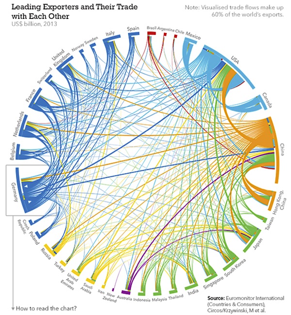
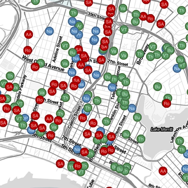
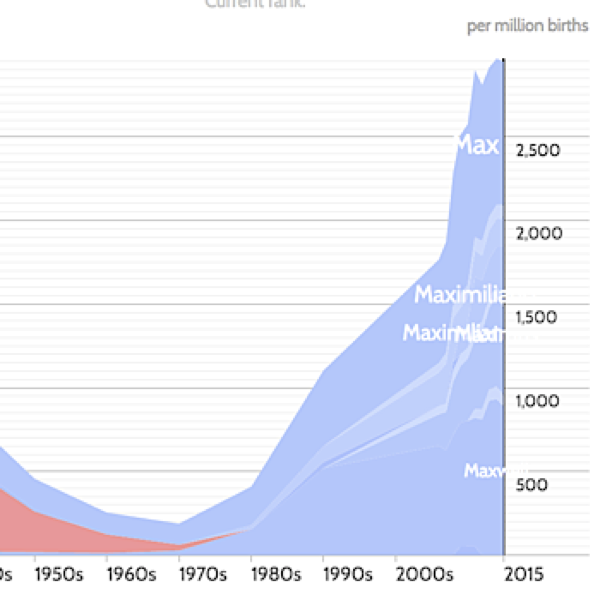
You know what I mean. Some things reek of data science. Google searches. Recommendation engines. The way a map app routes your car. Or dynamic visualizations like these:
 |
 |
 |
|
World trade |
Crime in Oakland |
Popularity of names beginning with “Max” |
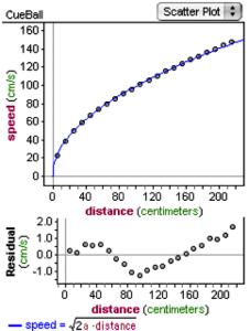 What distinguishes this obvious data science from a good school data activity? Consider the graph (at right) of data from physics. Students rolled a cue ball down a ramp from various distances and measured the speed of the ball at the foot of the ramp.
The student even has a model and the corresponding residual plot. Great data. But not data science. Why not?
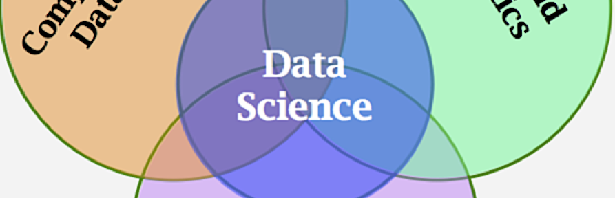
To answer that question, let’s look at one way some people have defined data science. The illustrations below, from Conway 2010 and Finzer 2013, show the thrust behind several definitions, namely, that data science lies in a region where content understanding, math and stats, and computer chops (Conway calls it “hacking”) overlap.


If we apply the left Venn diagram to the physics example, we can see that it belongs in “traditional research”: the work uses and illuminates physics principles and concepts from mathematics and statistics (the residuals, the curve-fitting) but does not require substantial computational skills.
But saying that is somehow not enough. The physics data example fails what we might call a “sniff test” for data science, but what, more specifically, does this sniff test entail? What are the ingredients that separate “regular” data from data science?
A Data Science Sniff Test
In our work over the last year and a half, we have begun to identify some of the telltale ingredients that make an activity smell like data science. And they come in (at least) three categories:
- Being “awash” in data
- Data moves
- Data properties
Although this formulation is certainly incomplete, it may be useful. Let’s look at each of these in turn.
Awash in data
Our obvious data science examples share a sense of being awash in data. The word brings up the image of a possibly tempestuous sea of data, or even waves of data breaking over us. This is subjective but still an evocative litmus test. More specifically, being awash might include:
- It’s easy to be confused by the data, and not know what it means.
- The best direction is often unclear, the path is not obvious.
- Our task is to find order in chaos; signal in noise; needles in haystacks.
- The situation is nonstandard, and therefore ripe for creativity and ingenuity.
Data moves
It’s useful to ask what data science students should be doing with data. Again, an incomplete list:
- Slice, filter, or otherwise choose cases. Given the data as presented, you can’t see a pattern, but if you choose a subset intelligently, a pattern emerges.
- Define new variables and design new measures.
- Make new or unusual visualizations.
- Reorganize the data.
Data properties
What aspects of a dataset are characteristic of situations where we use data science? This is related to “awash” but more specific:
- It’s multivariate: it has more than two or three variables.
- It’s large: at high school, it has few hundred cases or more—too many to consider plotting by hand.
- Non-obvious organization, that is, not flat. Perhaps the dataset is hierarchical or relational.
- It’s “unruly.” (Jones, 2017)
Applying the test
If we look again at the physics graph, we can see where it falls short. What did the students have to do? Make a graph of the two variables against one another. Plot a model. There was no search for a pattern, no sense of being overwhelmed by data, no subsets, no reorganization. The data are decidedly ruly.
That is not to say that working with this dataset is a bad idea! It’s great for understanding physics. But it’s not data science. And it points out the essential meaning of our sniff test: in this lab, students work with data, but they don’t have to do anything with the data to make sense of it. It’s science, but not data science.
Tilting the Ramp towards Data Science
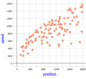 Let’s alter that rolling-down-a-ramp activity. The next figure shows a graph from the same sort of data, but with an important change.
This spray of points has a very different feel (or smell) than the original one. We can see that, in general, the farther you have rolled, the faster you go, but the relationship is not clean. What could be making the difference? A look at the dataset shows that we now have more attributes, including wheel radius, the mass of the wheels, the mass of the cart, and, importantly, the angle of the ramp.
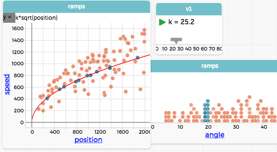
The ramps are at different angles? Maybe that makes a difference. Suppose we color the points by the angle of the ramp:

Now we see that the ramps range from about 5 to 45 degrees, and that, as we might expect, the steeper the ramp, the faster you go. We might be able to make predictions from this, but it would be nice to construct a graph like the original one. So we make a second graph, of just angle, and select the cases where the ramp angle is close to 20°.

Notice how the selected points show the square-rooty pattern of the original cue-ball graph. We can make a model for that specific ramp angle and plot it:
Sniff test redux
Let us re-apply our sniff test.
Awash in data? Look back at the first plot in this sequence with the eye of a first-year physics student. Confusing? Hard to tell where to start? You bet.
What are the data moves? We added a third dimension—color—to a plot to make a visualization we might not ever have seen before, and had to make sense of it. Then we found a way to look at a subset of the data, finding a clearer pattern there than in the dataset as a whole.
And data properties? We have more than two attributes, more than a couple dozen points. And depending on your experience, the data seem a bit unruly.
Wrap-up
This may not reek of data science, but it has more than just a whiff.
But wait: at the end, we got a graph with a function, a good model, just like we had originally. That’s a lot of extra work just to get the same graph.
Reasonable teachers ask, is it worth the class time to learn all that computer stuff in addition to the physics? In fact, the way we set up a typical lab is designed precisely to avoid the problems of the messy data. Why have students struggle with a situation where the variables are not controlled? Why not just teach them to control variables as they should—and get better-organized data, intentionally?
Let me give a few responses:
- You’re right, of course. Students should see better-organized data. But bear in mind that this is only an example where I can show some good data that do not smell like data science.
- Even so, if you have a desire to teach about data science, and not just data, you will have to deal with computer skills.
- This doesn’t have to be in physics. We cannot always design experiments where things are nice. Data science helps us explore, and cope with, all sorts of data and patterns.
-
It’s tempting to treat computer-data skills as an optional extra. Doing so creates an equity problem, because some people—people who look like me, mostly white and Asian boys—play with this stuff in our free time. Don’t let the playing field stay tilted.
That’s enough for now, but let us foreshadow where to go next:
If something else bothers you about this example, you’re not alone. I will describe what bothered me, and how that bothered Andee Rubin in a different way, soon.
References
Conway, Drew. 2010. Blog post at http://drewconway.com/zia/2013/3/26/the-data-science-venn-diagram.
Finzer, William. 2013. “The Data Science Education Dilemma.” Technology Innovations in Statistics Education 7, no. 2. http://escholarship.org/uc/item/7gv0q9dc.
Jones, Seth. 2017. Discussion paper for DSET 2017. https://docs.google.com/document/d/1DbgPq8mBwHOXmagHKQ7kNLP49PujyPq-tKip5_HeD8E

Reblogged this on roughlynormal and commented:
Hi Friends: this is a great article articulating how one statistics teacher has been thinking about “data science.” As a teacher of AP Statistics, Sports Research, and Computer Science Principles, I found this presentation very helpful. Enjoy!
It’s a nice start, but intro physics is probably not the best place to do data science. Physics is a model-driven field, where clean models do a ridiculously good job of describing real-world phenomena. Data science is more appropriate for data-driven fields (like biology and sociology), where there are no clean simple models to discover, and a big chunk of the work is coming up with approximate models that capture some important aspects of the messy data.
I agree. Stay tuned.
The sniff test suggests that data science only includes high-level skills, but if you think in terms of a developmental progression, then the more basic entry-level skills are part of a continuum. Couldn’t the on-ramp skills also be thought of as data science?
Good question. Reasonable people could answer either way, but for me (today anyway) the answer is no. Part of my motivation is trying to avoid what I’ll call “standards creep.” (Where do you draw the line on the continuum? I’m not sure.) So, an example: selecting a relevant subset of a large confusing data set is a data move, at least in the proto-data-science sense. I totally buy this; it’s not real data science, but it smells right and is pointed that direction.
But suppose you have younger kids just make a graph. Is that data science, or even proto-data-science? I claim that it’s not. It’s making a graph, which is an on-ramp skill and perfectly important in its own right. Connecting to the argument in this post, and the Venn, the graph is a mathy-statsy thing, and the data arose in some content domain. But it has no computer (or computer-ish) component that is all about dealing with the data themselves.