Time Series! Smoothing and COVID (and folding, too)

Welcome to the third in a soon-to-end series in which I figure out what I think about time series data, and how it is different from the data we usually encounter in school assignments. We’re exploring what tools and techniques we might use with time series that we don’t traditionally cover in stats or science, and wondering whether maybe we should. For me and my CODAP buddies, it also raises the question of whether a tool like CODAP should have more built-in support for time series.

Smoothing

One of these tools is smoothing. There is smoothing (for example Loess smoothing) for other, non-function-y data, but smoothing is easier to understand with time series (or any other data that’s fundamentally a function; the previous post in this series explains this obsession with functions).

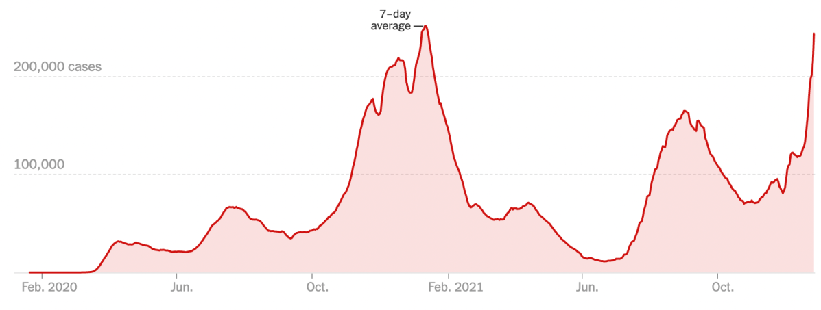
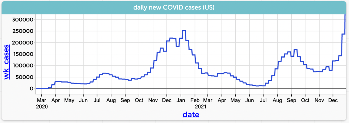
Since it’s December 2021, let’s stick with COVID and look at the number of new cases in the US by day (CODAP file here):

Daily newly reported COVID cases in the US. Data from https://ourworldindata.org/.
Graph in CODAP
Continue reading “Time Series! Smoothing and COVID (and folding, too)”

Time Series and Modeling

The second in a sequence of posts about time series. Here is the first one.

Students in traditional stats, as well as in science and math classes, learn linear modeling in the sense of finding a straight line that fits some data. Suitable data are often (but not always) time series: some phenomenon is increasing or decreasing regularly with time; you take repeated measurements; you plot the values against time; et voilà! A linear relationship.

Here is a data set I’ve used before. I put a pot of water on the stove, stuck a thermometer in the water, and turned on the flame. I recorded the time whenever the temperature passed another five degrees Celsius.

The author heated water on a stove. Graph in CODAP. We could clearly connect these dots with lines, and it would make sense.
Continue reading “Time Series and Modeling”

Thinking about Teaching and Time Series

Time series data shows the same phenomenon taken at different times. It’s possible, therefore, to plot the data—traditionally with time on the horizontal axis—and see how the data values change with time. As in the “banner” graph above.

The graph tells a story; and we read it chronologically from left to right. As experienced graph-readers, we see the surges and dips in COVID cases, as well as the vertical omicron rise (and as of this writing we have no idea what will happen!).

Continue reading “Thinking about Teaching and Time Series”

How can you be awash in data? Let me count the ways.

Three.

I oversimplify, of course, but this is what I’m thinking about; and this came as a result of attending an advisory meeting about a cool project called Data Clubs. And as usual for this blog, we are using CODAP.

Continue reading “How can you be awash in data? Let me count the ways.”

Weather Models Reflection

Last time I described an idea about how to use matrices to study simple weather models. Really simple weather models; in fact, the model we used was a two-state Markov system. And like all good simple models, it was interesting enough and at the same time inaccurate enough to give us some meat to chew on.

I used it as one session in a teacher institute I just helped present (October 2019), where “matrices” was the topic we were given for the five-day, 40-contact-hour event. Neither my (excellent!) co-presenter Paola Castillo nor I would normally have subjected teachers to that amount of time, and we would never have spent that much time on that topic. But we were at the mercy of people at a higher pay grade, and the teachers, whom we adore, were great and gamely stuck with us.

One purpose I had in doing this session was to show a cool use for matrices that had nothing to do with solving systems of linear equations (which is the main use they have in their textbook).

Some takeaways:

  • Just running the model and recording data was fun and very important. Teachers were unfamiliar with the underlying idea, and although a few immediately “got it,” others needed time just to experience it.
  • Making the connection between the randomness in the Markov model and thinking about natural frequencies did not appear to cause any problem. I suspect that this was not an indication of understanding, but rather a symptom of their not having had enough time with it to realize that they had a right to be confused.
  • The diagram of the model was confusing.

Let’s take the last bullet first. The model looked like this:

Our two-state Markov weather model. Use one die to update today’s weather to tomorrow’s.
Continue reading “Weather Models Reflection”

Weather Models and Matrices

Ack! I don’t have time to do justice to this right now, but any readers need to know if you don’t already that the geniuses at Desmos seem to be making a matrix calculator: https://www.desmos.com/matrix.

Having read that, you might rightly say, I can’t get to everything in my curriculum as it is, why are you bringing up matrices? (You might also say, Tim, I thought you were a data guy, what does this have to do with data?)

Let me address that first question (and forget the second): I’m about to go do a week of inservice in a district that, for reasons known only to them, have put matrices in their learning goals for high-school math. Their goal seems to be to learn procedures for using matrices to solve systems of linear equations.

I look at that and think, surely there are more interesting things to do with matrices. And there are!

Continue reading “Weather Models and Matrices”

Sometimes, articles get done

Back in 2017, I gave a talk in which I spoke of “data moves.” These are things we do to data in order to analyze data. They’re all pretty obvious, though some are more cognitively demanding than others. They range from things like filtering (i.e., looking at a subset of the data) to joining (making a relationship between two datasets). The bee in my bonnet was that it seemed to me that in many cases, instructors might think that these should not be taught because they are not part of the curriculum—either because they are too simple and obvious or too complex and beyond-the-scope. I claimed (and still claim) that they’re important and that we should pay attention to them, acknowledge them when they come up, and occasionally even name them to students and reflect explicitly on how useful they are.

Of course there’s a great deal more to say. And because of that I wrote, with my co-PI’s, an actual, academic, peer-reviewed article—a “position paper”; this is not research—describing data moves. Any of you familiar with the vagaries of academic publishing know what a winding road that can be. But at last, here it is:

Erickson, T., Wilkerson, M., Finzer, W., & Reichsman, F. (2019). Data Moves. Technology Innovations in Statistics Education, 12(1). Retrieved from https://escholarship.org/uc/item/0mg8m7g6.

Then, in the same week, a guest blog post by Bill Finzer and me got published. Or dropped, or whatever. It’s about using CODAP to introduce some data science concepts. It even includes figures that are dynamic and interactive. Check out the post, but stay for the whole blog, it’s pretty interesting:

https://teachdatascience.com/codap/

Whew.

When research questions don’t make sense: use claims!

I need to write up this Very Small Thought in order to get it off my to-do list. The basic thesis is: when we ask students to do rich, open-ended projects, we often insist that they write “research questions.” Sometimes this is a terrible idea.

Don’t get me wrong: asking students to come up with research questions can be important. Many frameworks for how science works have “formulate a research question” as an early step. Furthermore, when you grow up, some grant proposal RFPs insist that you specify your research questions.

Continue reading “When research questions don’t make sense: use claims!”

Data Moves with CO2

The concentration of CO2 in the atmosphere is rising, and we have good data on that from, among other sources, atmospheric measurements that have been taken near the summit of Mauna Loa, in Hawaii, for decades.

Here is a link to monthly data through September 2018, as a CODAP document. There’s a clear upward trend.

CO2 concentration (mole fraction, parts per million) as a function of time, here represented as a “decimal year.”

Each of the 726 dots in the graph represents the average value for one month of data.

What do we have to do—what data moves can we make—to make better sense of the data? One thing that any beginning stats person might do is to fit a line to the data. I won’t do that here, but you can imagine what happens: the data curve upward, so the line is a poor model, but the positive slope of the line (about 1.5, which is in ppm per year) is a useful average rate of increase over the interval we’re looking at. You could consider fitting a curve, or a sequence of line segments, but we won’t do that either.

Instead, let’s point out that the swath of points is wide. There are lots of overlapping points. We should zoom in and see if there is a pattern.

Continue reading “Data Moves with CO2”

Don’t Expect the Expected Value

One day, over 50 years ago, we were visiting Lake Tahoe as a family, and dad went across the border to play keno. He came back elated: he had hit seven out of eight on one of his tickets, and won eleven hundred dollars. He proudly laid out fifty twenties and two fifties on the kitchen table. It was a magnificent sight.

The details of keno are unimportant here, except to note that keno is not a game of skill. Of course the house has an edge. In the long run, you will lose money playing keno no matter how you do it. Even my dad, who over the years has played a lot of keno, and won even bigger payouts, would probably admit that he might have a net lifetime loss.

So why do people play? There are lots of reasons, I’m sure, but one of them must be connected to that heartwarming anecdote: fifty years later, I remember the event clearly, as one of joy and wonder.

Let’s explore that using roulette, which is much simpler than keno. A roulette wheel has 18 red and 18 black numbered slots, plus a smaller number of green slots (often two). You can make many different bets, but we will stick with red and black. If you place a $1 bet on red, and it comes up red, you get $2 back (winning $1); if it comes up black or green, you lose your dollar.

Continue reading “Don’t Expect the Expected Value”