We’re starting to learn about probability. Surely one of the quintessential settings is rolling two dice and adding. I’ll try to walk that back another time and rationalize why I include it, but for now, I want students to be able to explain why seven is more likely than ten. I want them to have that archetypal diagram in their heads.
But starting with the theoretical approach won’t go very well. Furthermore, with my commitment to data and using randomization for inference, an empirical approach seems to make more sense and be more coherent. So that’s what I’m trying.
The key lesson for me for this report—related to “trust the data”—is that actual data, with the right technology, can illuminate the important concepts, such as independence. This makes me ask how much theoretical probability we need, if any.
What Happened in Class
To do the Dice Sonata (previous post), I had given each student two dice: a red one and another one. They rolled them 50 times, recording each result twice: once to do the sonata, so they could make the graph of actual results by hand, and also on the computer in a Fathom Survey so we could easily assemble the results for the entire class.
If you haven’t used Fathom Surveys, you can think of it as a Google form that you can later drag directly into Fathom. The key thing here is that they recorded the red die and the other die separately. When we were done, we had 838 pairs.
This was Thursday, the second class of the semester. After students discussed the homework, and saw that their sets of 50 rolls didn’t produce graphs with their predicted shapes, we went to the computers to see if things looked any different with more data. To make the relevant graph, students had to make a new attribute (= variable = column ) to add the two values—which they already knew how to do. Here is the bottom of the table and the graph:

One could stop here. But Fathom lets us look more deeply using its “synchronous selection” feature (stolen lovingly from ActivStats): what you select in any view is selected in all views.
First I asked them to predict what they would see if instead of graphing the sum, they graphed just the red die. This ranged from “humpy in the middle” to “going straight across.” I asked the “straight” student if it was going to be totally straight or mostly straight. This was a confusing, so we just made the graph. We made a graph of other as well, and saw that the bars were not totally even, but varied (reinforcing, I hope, the ongoing experience of how actual, finite distributions differ from what we “expect”).
Then I asked them to predict what it would look like if I selected the bar for red = 2. Really nobody had any idea, so we did it:

I asked them to talk in pairs about what the graphs meant, and how you could explain why they look the way they do. This was lovely in that it’s straightforward and understandable—e.g., since the red die is 2 you can only get 3 to 8 for a sum—but gives you ways of thinking about more complicated things such as conditional probability. I hope. (For example, what’s the probability of the sum being 5 given that the red die is 2? One-sixth. We did not go there at this time!)
Looking at the other graph, I asked what it meant that the red part looked more or less even all the way across. Fortunately, one student (who for reasons I want to figure out was unusually “present”) said something like
It means they’re not related to each other.
What do you mean by that?
Well, the red die has no effect on the other die.
After picking myself off the floor and having him explain this insight a little more, I explained that this was an important concept called independence. It should be obvious that one die has no effect on the other, but it’s not always that way; for example, red and sum are not independent. Which also makes sense because, after all, we calculate sum from red.
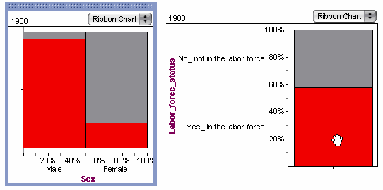
Furthermore (I said, hoping not to run off the end of the pier) this is totally related to what we were doing last semester, where we saw that things not lining up in a ribbon chart showed an association between two variables; that if there was a strong association, the variables were not independent.

See how this would be impossible if we were having the theoretical discussion? See how it would be impossible if they weren’t using the technology?
And then…
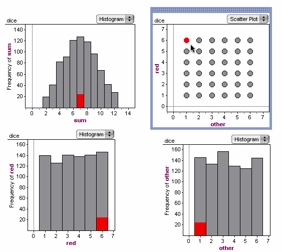
I pointed out how we had all sorts of graphs, but there were more we could still make. I asked them to predict what would happen if we plotted red against other. At this point, even the most mathematically experienced students made that hand gesture that indicates, straight line, slope of one. So I did it before their very eyes. They looked way puzzled. I asked them to talk with that partner to explain why the graph looks the way it does; a hint was to select one of those points and see what happens.

This quickly helped them see why they got a grid instead of a line. And of course, we could select bars in the other graphs, in particular, this is what you see if you select the “7”:

O-M-G: it’s the empirical version of the archetypal diagram. We can now ask and answer why 7 is more likely than 10 (and even why 7 is twice as likely as 10) using our own experience and data. On the way, we got to discuss independence and connect it to what we had done with association last semester. And all of this is (I hope) setting us up for using graphs like these to show empirical sampling distributions and calculate P-values and all that.
So here’s a big question: will these students actually understand probability (as much as any high-school student does)? And what does that really mean? For example, I think a big problem in the two-dice setting is really getting it that five-three and three-five represent two different combinations that add to eight, but four-four represents only one. This lesson’s structure (fortuitous structure—I did not carefully plan it this way) supports that understanding by having the dice be different colors, having students record the dice separately, and using technology that lets students explore the data and representations flexibly. But is that sort of thing enough?
I’m also doing another strand on the theoretical side, purposely delayed slightly to give them empirical first. But will the empirical work support that, or will the clean theoretical area charts and tree diagrams dismantle what they’ve learned through rolling dice and doing the analysis?
A Final Note on Technology and Kid Behavior
It’s hard to write up a lesson like this and give it the right flavor. When I say something like, we make the graph and select the “2,” what really happens is that the students click all over the place. They select the two, the three, the five. The inherent dynamics of the software give them not just one example, but many, in rapid succession, all under their control.
Even when I’m trying (often in vain) to direct the class, and pull them from the computers to the big U-shaped table, leading a discussion or showing them what I’m talking about on the big screen, the students often roll back to their computers to see it themselves. This is a mixed blessing, as you can imagine.
They’re great explorers. Whence this final example: I learned from the students what happens when you take that “grid” graph, which is by default a scatter plot, and choose Line Scatter Plot from its menu:


4 thoughts on “An Empirical Approach to Dice Probability”